WWMT is a recurring column from Reed Words about good-natured creative envy.
It features conversations with people who created something that makes us think — damn, we wish we were part of that.
For each, we get to know the people behind the project and discuss inspiration, the creative process, and the role of words in their work.
When your country calls
Rebranding a nation: dream job, or potential nightmare?
We all know how bureaucratic and risk-averse big corporations can be. Imagine having an entire government — and all their endless departments and agencies and regional officials — as your client.At the same time, what an opportunity! “I rebranded a country” is a pretty sweet addition to the CV. And the depth of strategy and range of execution required is an enticing prospect to the weirdos that enjoy that stuff. Guilty.
It’s a fascinating challenge to solve, with a sprawling set of knotty considerations. How do you capture the essence of an entire nation? Will the brand be legible across languages? Stoke pride and a sense of ownership across different cultures? Does it work as well for the post office as it does in a tourism ad at the airport?
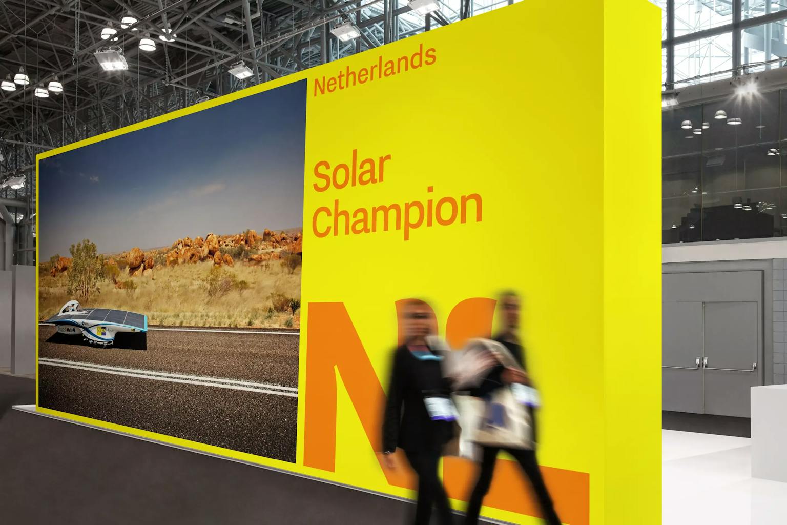
Studio Dumbar is one of the few agencies that knows first-hand what it’s like. Their rebrand for the Netherlands pulls off the hat trick of being instantly recognizable, distinctly Dutch, and functional enough to easily adapt across countless contexts. Naturally, it won them all sorts of recognition and has quickly become an iconic shorthand for the Netherlands as a whole.
We spoke to the strategy director at Studio Dumbar, Tom Dorresteijn, about bringing it all to life.
The Netherland's former
Tell us a bit about Studio Dumbar. What defines your approach?
It’s in our DNA to always be looking ahead of the curve. We’re not so interested in trends and styles and what's cool at the moment — we really try to look deeper. And then we always aim to do something that not everyone else is doing. Because that's boring, and it’s less effective. You're not efficient in communicating if you look like everyone else.
Also the way we use technology. We are really kind of at the leading edge in motion design. We work and experiment with all the available software, but we also do creative coding and develop our own proprietary tools for motion design.
What is your criteria for successful design?
Design to me is about conveying as much as possible about who you are, what your nature is, and what your personality is, often in an instant. And then, again, it's important to be remarkable, to show who you are in a way that’s interesting and that captures attention.
How do you approach strategy?
The three key words that define our strategic approach are pure, simple, and powerful.
We start by trying to get into the core of an organization by asking basic questions: Where do you come from? Who are you? Where are you now, and where do you want to go?
We want to get beyond what is said in stakeholder meetings. Because there is always so much valuable stuff to uncover. When you’re inside an organization you kind of have this blindness — you don't see as sharp as an outsider.
"When you’re inside an organization you kind of have this blindness — you don't see as sharp as an outsider."
Then we distill what we learn into the positioning. That’s the purity. And while we might present a lot of context and information, at the end we really aim to deliver an extremely simple and clear positioning. One slide, just a few words.
Once we have that, we begin to interpret it creatively. And almost by definition, if you achieve that strategic purity, powerful and lasting design will emerge. Because it comes from something essential and enduring and true.
It’s often a challenge to reach that clarity with a large company. A nation seems like it's on an entirely different level. How did your approach fare on such an ambitious project?
When the European Union started with 12 member countries, they called the process of organizing all these different nations and interests “12 dimensional chess.” That kind of sums it up. Thankfully, the bulk of the decision making was done before we started. So we had a foundation. They knew they wanted the brand to be the wordmark – “Netherlands,” not “The Netherlands.” And we had a positioning, which took them two years of engagement to establish.
Working from an existing positioning poses its own challenges.
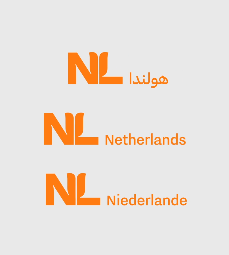
Yes, and we still wanted to do our own discovery. And one of the first things we learned is that, actually, quite a few of the organizations involved didn't want to accept the word “Netherlands” as the starting point for the design. Which makes sense. The design has to work across languages, so using a word as the foundation of the brand immediately creates challenges. It’s not going to be consistent in Arabic and in Chinese and Hebrew — the design will have to change depending on the language.
So you immediately had to take a new tack. What was the solution?
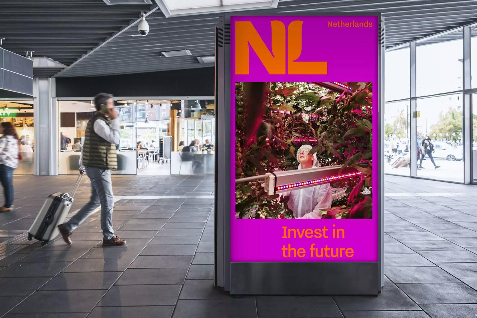
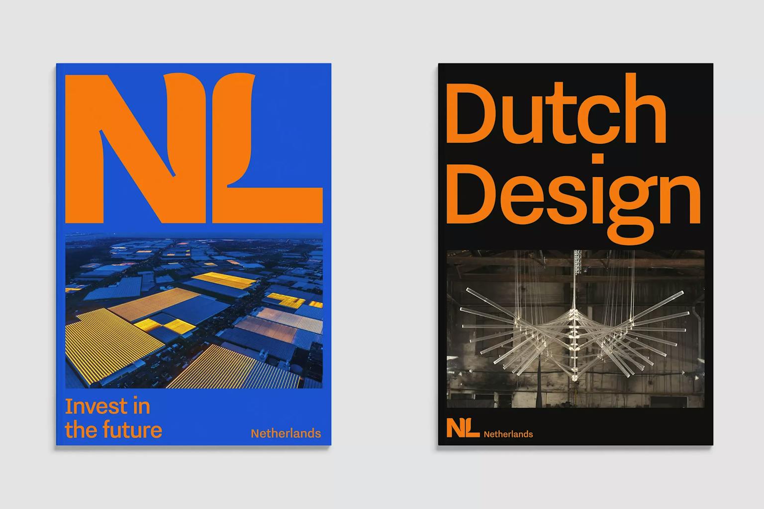
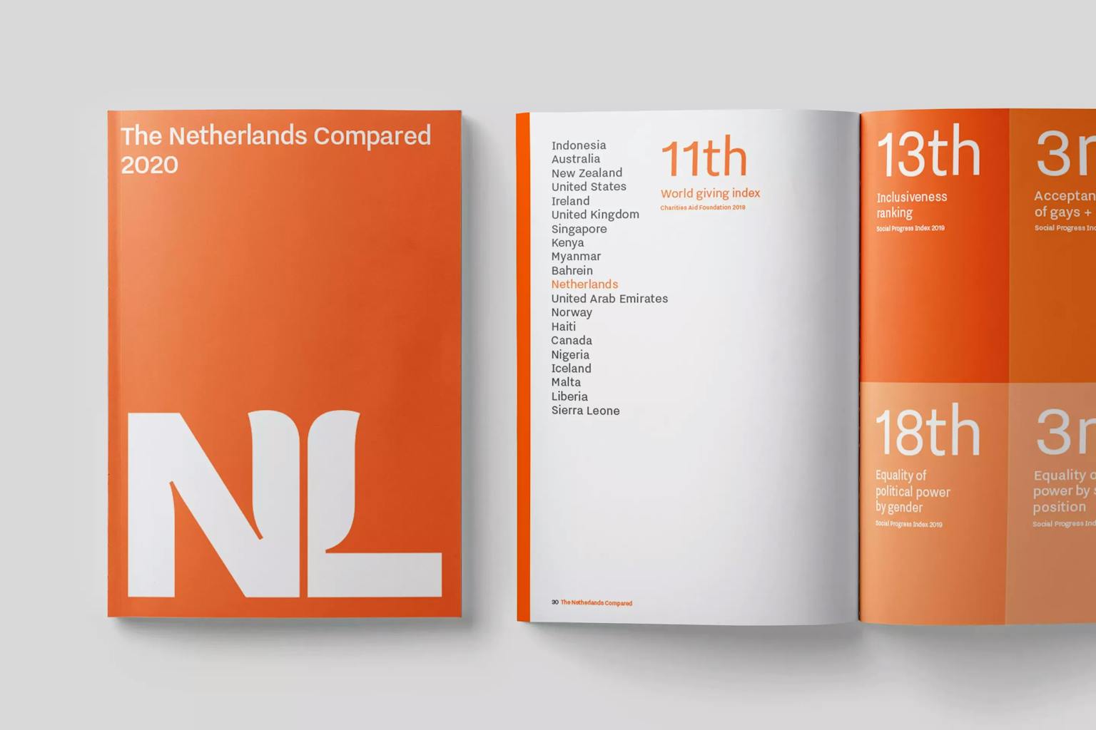
We found quite a simple solution. Why don’t we use “NL”, which is the official acronym for the Netherlands? All Dutch people have a relationship with it. We identify with it, like how the British identify with UK. Many people outside the Netherlands know it, and if they don't, it's not a problem because it can easily function as a symbol for the Netherlands. Miraculously, with a myriad of stakeholders involved, everyone agreed to that.
How did you arrive at the stylized tulip logo?
It’s funny. At the outset, we said we’d only design a tulip, or windmills, or wooden clogs over our dead bodies. And then in the design process, one of our designers came up with the tulip reference using the NL acronym, and we were like, well, shit: that’s pretty good!
"We said we’d only design a tulip, or windmills, or wooden clogs over our dead bodies. And then [. . .] we were like, well, shit: that’s pretty good!"
In the end it was really cool to find a fresh take on such a recognizable symbol. The problem with the old tulip logo — the one in the Netherland’s previous brand — was that it felt childish and touristy, and it didn’t work at all for universities or the high-tech or creative industries. But by finding a subtle, modern interpretation, we can nod to tradition while looking forward, and it works well as a metaphor across applications — from high tech to education.
What other considerations come into play when working on a brand with so many stakeholders?
It had to be very easy to use. There are a huge amount of people that will work with it around the world — 140 embassies and consulates, trade delegations, etc. And many don't have design agencies working for them, or even designers on staff. So it had to be very simple, bold, and clear.
And that directness ultimately fits nicely with the overall Dutch mentality. We’re very direct, no bullshit, no tralala. Creative, but direct. And that comes through in the brand — the font, the logo, the choice of color.
Color plays a big role in the design. The palette feels familiar but fresh. What guides your decision making around color?
The Netherlands has four important colors. The red, white and blue of the flag, and then orange. Orange is our most popular color — any team, any celebration, they’re going to be wearing orange. So those were a given.
But you need to have enough diversity because it's got to work in every industry. You need to have brightness and contrast so it feels recognizable. The colors need to have the flexibility to be very exuberant, or more toned down and serious. And they have to be simple to work with, even for non-designers. They have to look good even if you don’t have a designer to put it together.
So we worked to create a palette that can do all that, but that still has a kind of energy. You need to be able to feel the energy.
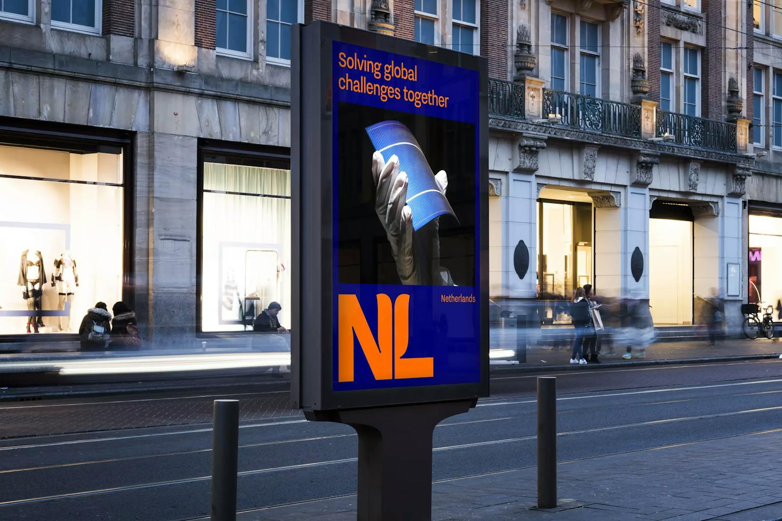
The OOH examples I’ve seen take a very minimalistic approach to language. But governments often have to communicate a lot. How did you think about language in the context of this brand?
We really pushed for less is more, and clarity as the number one priority. But we had to create some flexibility, so if they do need to use a lot of words, the brand can facilitate that. But we did really try to keep it super limited. And that’s a good push for the type of writing they do anyway. It should be very to the point, very short, and very clear.
How has the brand been received? Now that it’s been put to the test, is it working as you imagined? Is it aging well?
It’s worked really nicely, I think. Partly because it’s so simple and subtle, and uses elements that we’re so familiar with: the tulip, the NL acronym. It touches people somehow. And it’s been embraced around the world — it's more as if too many people want to use it rather than them having to be forced to use it. Which is great.
As for staying power, I think it’s quiet enough that you don’t get bored or annoyed with it. And this was such a long, hard process that I don’t think they want to do it again anytime soon.
And then it was very positively received in the industry. The leading international design blog Brand New ranked the best logos of the year, and we got sixth place. To place sixth with the brand for a country, where all this compromise has to happen, was really satisfying — because it means we succeeded in making something strong in a very complex environment. And that’s a good summary of what we set out to do as an agency.
Finally, what’s something you wish you made?
It would absolutely be one of Willem de Kooning's paintings — any work from the middle period of his life as a painter.
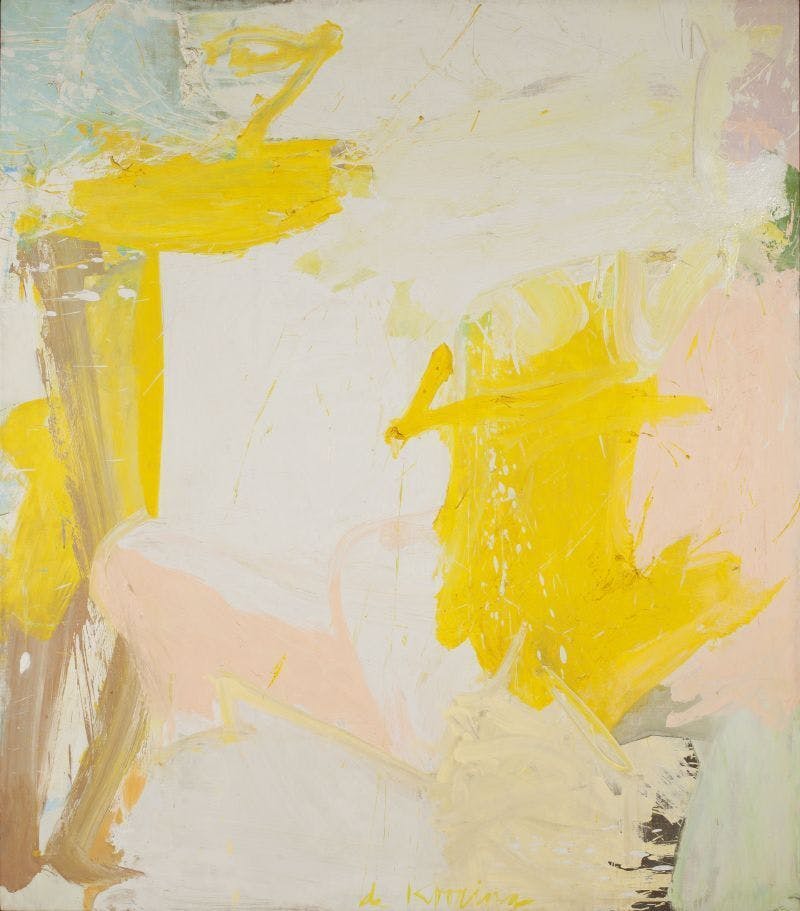
Willem de Kooning
"Rosy-Fingered Dawn at Louse Point"
Related articles.