WWMT is a recurring column from Reed Words about good-natured creative envy.
It features conversations with people who created something that makes us think — “damn, we wish we were part of that.”
For each, we get to know the people behind the project and discuss inspiration, the creative process, and the role of words in their work.
We're not watching paint dry
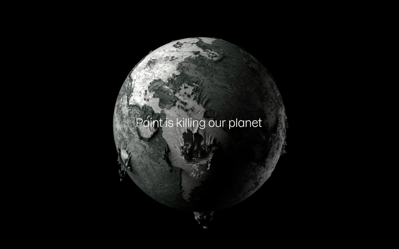
I'm going to talk about an industrial B2B sustainable coating materials company. Wait — don’t go. There’s more than meets the eye here. Aero has developed a way to coat surfaces without the dramatic negative environmental impacts of traditional paint, while adding a host of performance benefits.
Cool tech? To be sure. A promising foundation for an award-winning rebrand? Not necessarily.
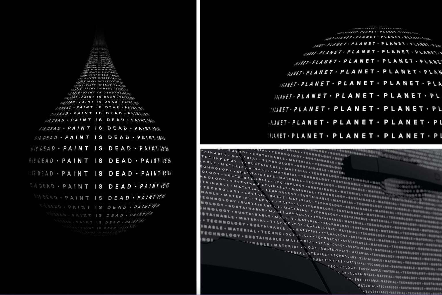
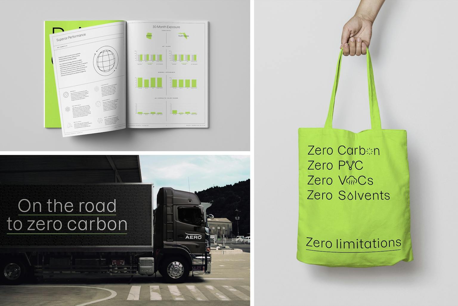
But London-based Magpie Studio pulled it off. They turned tired visuals, heaps of industry jargon, and a laundry list of esoteric benefits into beautiful content that tells a simple but powerful story: paint is killing the planet, and Aero’s pioneering a path to a greener future.
In the process, they shifted the paint-by-the-numbers paint alternative manufacturer to a brand that feels original, important, and genuinely interesting.
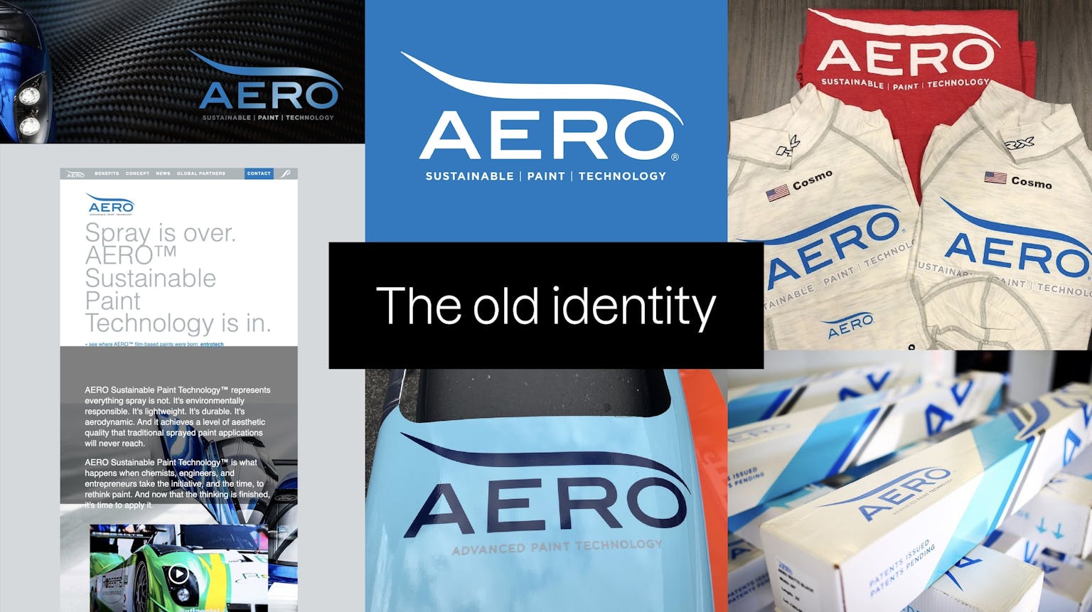
Aero's previous visual
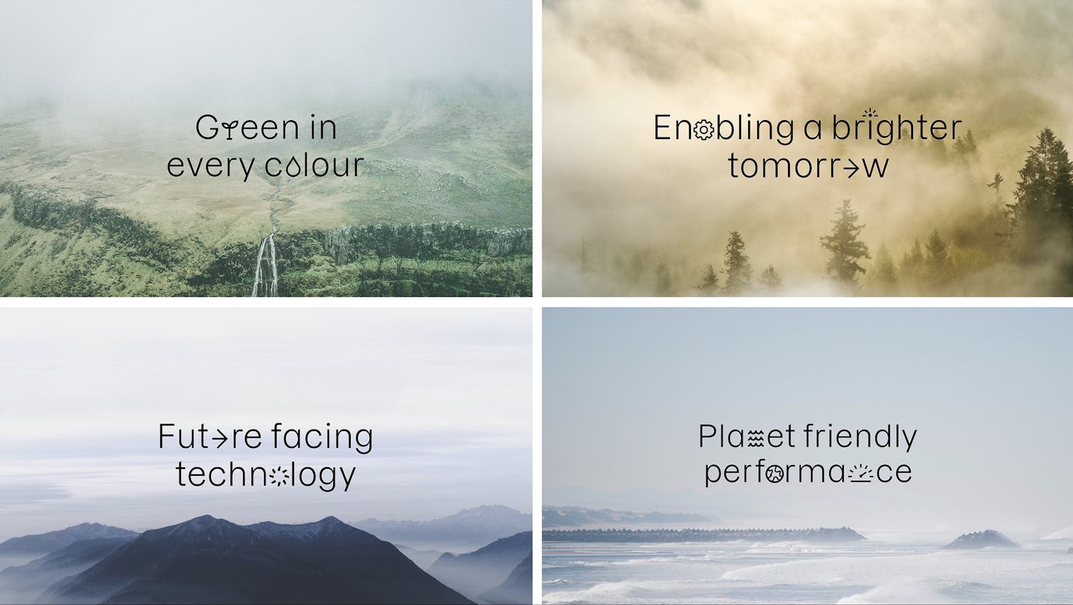
Eye-catching color, motion, and clean design bring Aero’s identity up to date with the 21st century — or maybe the 22nd. Distinctive graphics and clever animation streamline information. The spiky, confrontational voice commands attention.
It all comes together to clarify the value Aero offers on both a product and planetary level. And it uncovers the big, disruptive ambitions that were lying latent within the brand.
We spoke with two members of the Magpie Studio team — Ben Christie, founder, and Rebecca Magnus, director of writing and strategy — to hear more about a project we wish we could have been a part of.
How’d it start?
Ben: We were actually initially approached by a contact at JLR — Jaguar Land Rover. The short version is Aero was a supplier of theirs, and JLR basically said to them, “You really need to redesign your brand. Your products are amazing, but your brand is terrible.”
Then JLR connected us to Jim McGuire, CEO at Aero.
Who is the new brand meant to reach?
Ben: The audience is interesting, because the CEO learned that the real people to reach aren’t the money men — they’re the design teams. And the rebrand was very much driven by a need to appeal to them.
They’re very aesthetics-driven, so it needed to be attractive, to feel kind of like a sexy technology company. So we knew we wanted it to be quite a dynamic identity, and that the website would feel very lyrical and detailed and crafted.
It’s a big shake-up from where they were. Did you have to push them to make that leap?
Ben: They knew they needed to make a big leap. Apart from the logo, everything was up for grabs. There was a real appetite to disrupt the category.
Aero is very much the small, upstart challenger versus the bigger companies like 3M and PPG. And the CEO is a real character — he was like, “I want to scare those guys.”
Did that mean a major shift in positioning?
Rebecca: It was a complete switch in positioning, from a paint manufacturer to, really, a technology company. And from a typical B2B industrial brand to a real design-led innovator and leader. Because that's what's really going to stand out in the market for clients like JLR.
Paint is dead is a particularly bold line. How’d you get there?
Rebecca: Yeah, it really doesn’t get more ballsy than that in the paint industry.
We wanted to lead with an identity that felt totally and utterly different from what you would assume a paint manufacturer would look like. And that was based on the positioning — that Aero isn’t just another paint manufacturer. They’re a surfaces technology company.
So, choosing to lead with “paint is dead” seems like madness, but actually it made the product stand out in just the way it needed to. It was an intentional provocation. We wanted to completely change the way people thought about this product.
We’ve all worked with brands that have to convey a bunch of technical details and benefits. I love that you’ve managed to do that in a really clear and engaging manner, while reinforcing the larger brand story.
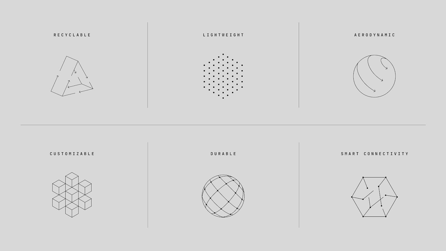
Rebecca: We were bombarded with information, and with a B2B brand like this, it’s always a question: how do you balance clarity with the right level of technical information so that you have the rigor there for the people that need it? Plus, for this technology there was also the question of how to visualize it. If you show it on a product, it just looks like a car.
So we started by trying to find the stories in all that detail and then organize the information into clear narratives. One of those narratives became a kind of platform for the brand — the idea of “engineered from the molecule up.”
It helps that they’re able to back up these really strong benefits. The comparisons are so stark that even a layperson can understand the impact. So it was about bringing that to the front of the brand and presenting it in a really accessible and visually interesting way.
How would you describe your approach to strategy? How does writing come into play?
Rebecca: We don't have a cookie-cutter “Magpie approach to strategy,” and I think that's a good thing. We do what’s right for the project.
As for my personal approach, I ask the same probing questions that I'd ask as a writer to try and get to the essence of the client need.
Often, writing lines can unlock ideas. When you write a brand platform, you keep writing until you think, ah, this is the thing that I'm trying to capture. And then you’re sharpening up that writing so that it really feels distinctive and meaningful and precise.
"Writing is thinking — if you can write well, you can think, and you can do strategy."
What are your thoughts on the relationship between writing and strategy?
Rebecca: I like that we’re seeing a lot more writers doing strategy, rather than having these siloed disciplines. Because there's so much crossover between how writing works and how strategy works. Writing is thinking — if you can write well, you can think, and you can do strategy.
There’s a lot of complication in the industry that doesn't really add much. Strategy can often be so vague that it’s kind of meaningless. So I like to bring a lot of writing rigor into the process, while also remembering that strategy is there to facilitate other people's thinking.
Which is why I think the skills that you learn as a writer are super applicable to strategy: because a great writer is great at facilitating that thinking.
Tell us a bit about Magpie Studio.
Ben: We kind of cut our teeth in print. We really started as an advertising and design agency and then evolved into a branding agency over a period of about 14 years. That’s been a process of bringing all the major disciplines in-house and expanding our capabilities to build brands from the ground up.
How would you describe Magpie’s creative approach?
Rebecca: In terms of the work that Magpie does, I think it's a nice mix of intuitive and creative work, but grounded in really solid strategic thinking.
We’re always asking, how do we create these magic moments of connection? How do we create something that's befitting of what this business actually does? And, how can we add a little bit of a playful soul to everything that we do?
Play is such an important part of creativity. And I think that when we can bring those playful moments that spark connection, it really elevates the brand. It’s a powerful combination.
Finally, what’s something you wish you were a part of?
Oatly is probably the project I referenced the most over the last few years as an example of brilliant, brain-warming branding.
There’s been so much imitation since — a classic sign of good design. For me, it’s a great example of graphics and copy perfectly harmonizing.
The design is simple but memorable. They managed to own an iconic style of illustration that was actually really easy to build on in-house. The top-line strategy was solid. And the copy was killer, from the stop-you-in-your tracks headlines (“Like milk, but for humans”), to the provocative environmental rallying cries (“Hey dairy industry, show us your stats”), to the quirky, relatable ramblings on side of pack.
Oatly took the baton from the increasingly tired and Coca-Cola bloated Innocent and ran with it. It's a new benchmark for FMCG.
Related articles.