
Visit your local grocery store, grab a product off the shelf, flip it over — and there it is. Wedged between the ingredients list and the nutritional info. A few lines in font this big.
It’s back of pack copy. And it deserves better.
To be clear, I’m biased. My words have been printed on the backs of yogurts and crackers and shampoos, and maybe I’m annoyed you need a microscope to read them. But the neglect of back of pack (let’s call it “BoP” from now on) goes deeper than that. So what makes BoP a flop, and how do you fix it?
Bad back of pack
For me, bad BoP sits in one of two camps.
The first: pure cardboard. High in information, low in effort or readability. When your pack copy has about as much personality as the barcode, it raises questions. Does this brand care? Who are they speaking to? Why does this sound so different to their ads? It’s a wasted opportunity. And most food packaging is already wasteful enough.The second type: the chatterbox. Here you’ll find rambling founders’ stories, statements telling you to seize the day, or messages about the brand’s deep and unique purpose. As if that has anything to do with canned tuna, or crunchy pecan granola bars.
Good back of pack
Good back of pack tells you what you need to know about the thing inside, while letting the brand voice shine. It’s not a cut-down version of the manifesto from the strategy deck. Or something the intern threw together to replace the lorem ipsum. It’s as important as any other touchpoint. Because it’s the touchpoint you actually touch.
A lot of expensive work goes into getting someone to pick up your product. Beautiful design. Lovely substrates and foils. So once your packaging is in their hands, don’t blow it. It might only be 50 words, but at this moment it’s the most important 50 words in the customer journey.
That’s why the brands that pay attention to it stand out in a big way. I’ll try and talk about some examples that aren’t Innocent or Oatly.
I failed. Here’s Innocent and Oatly:
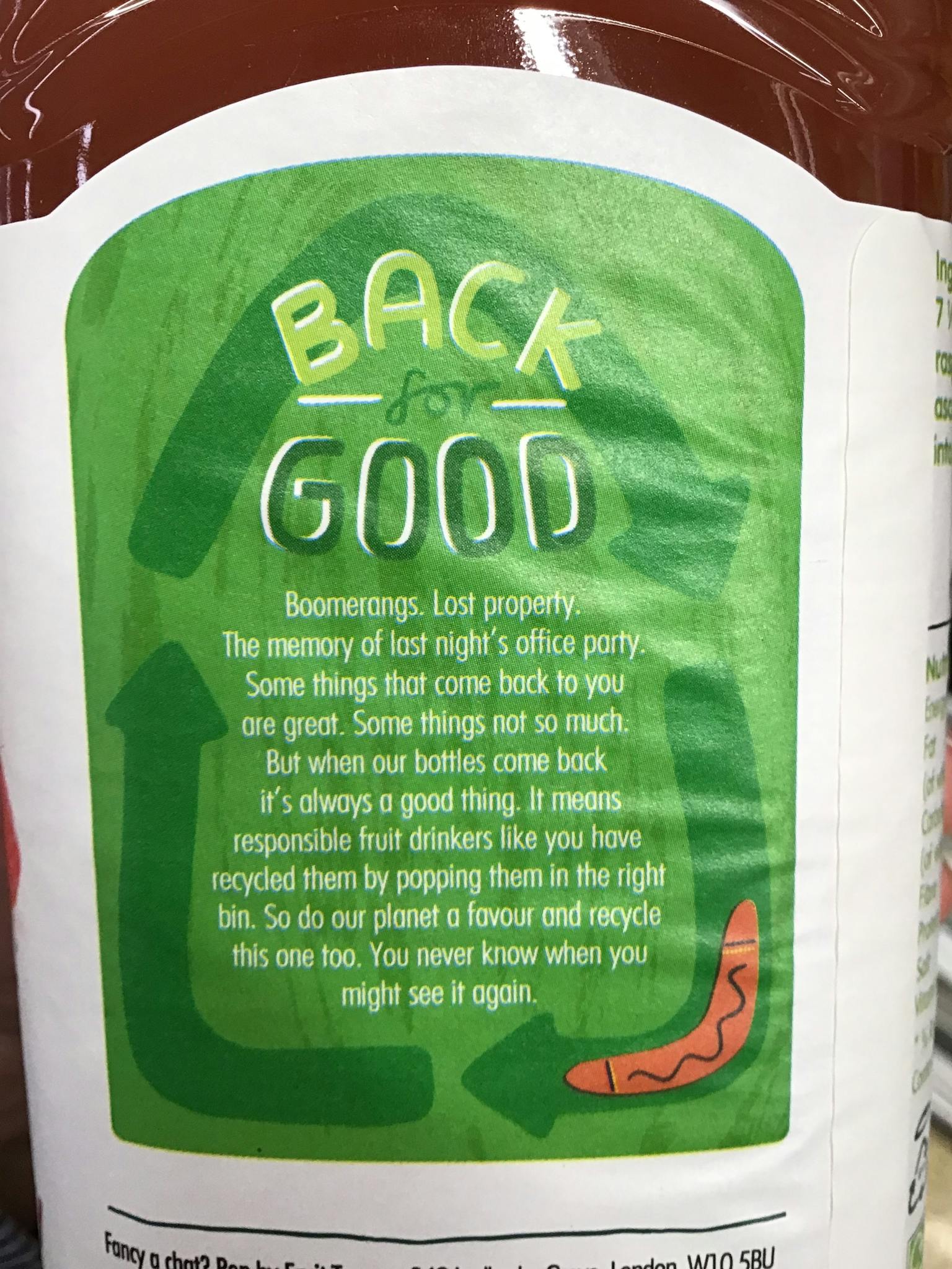
Innocent packaging
“Boomerangs. Lost property. The memory of last night’s office party. Some things that come back to you are great. Some things not so much. But when our bottles come back it’s always a good thing. It means responsible fruit drinkers like you have recycled them.”
– Innocent, Apple & Raspberry Juice.
“Please recycle this cup as paper carton. Or upcycle it into a party hat or decorative tree ornament or a house for a really small pet or something considerably more practical that this sentence was unfortunately unable to recommend.”
– Oatly, Strawberry Oatgurt
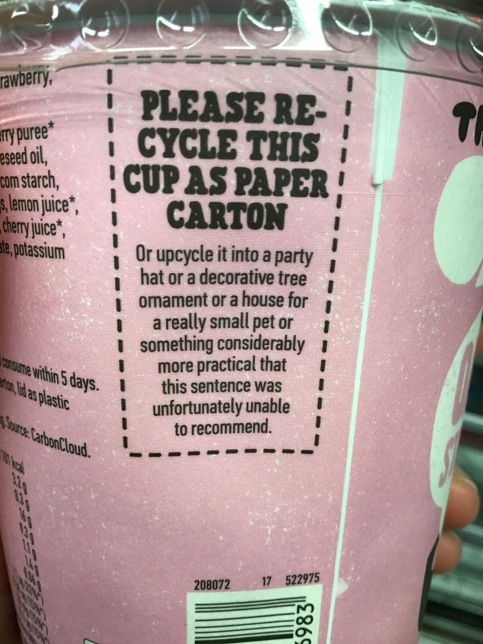
Oatly packaging
These are dangerously close to entering chatterbox (or chatterbottle) territory, but their trademark voices help them get away with it. They’ve put effort and creativity into a message that could have just read “please recycle.” When brands take every opportunity to remind us of who they are, eventually it sticks. And maybe they even increase the chances of someone recycling along the way.
A few other BoPs that caught my eye recently:
“Drop that chemical nonsense and get this sauce up in your grill. No gunk. No junk. Just naturally tasty.”
– Dr Will’s BBQ Sauce
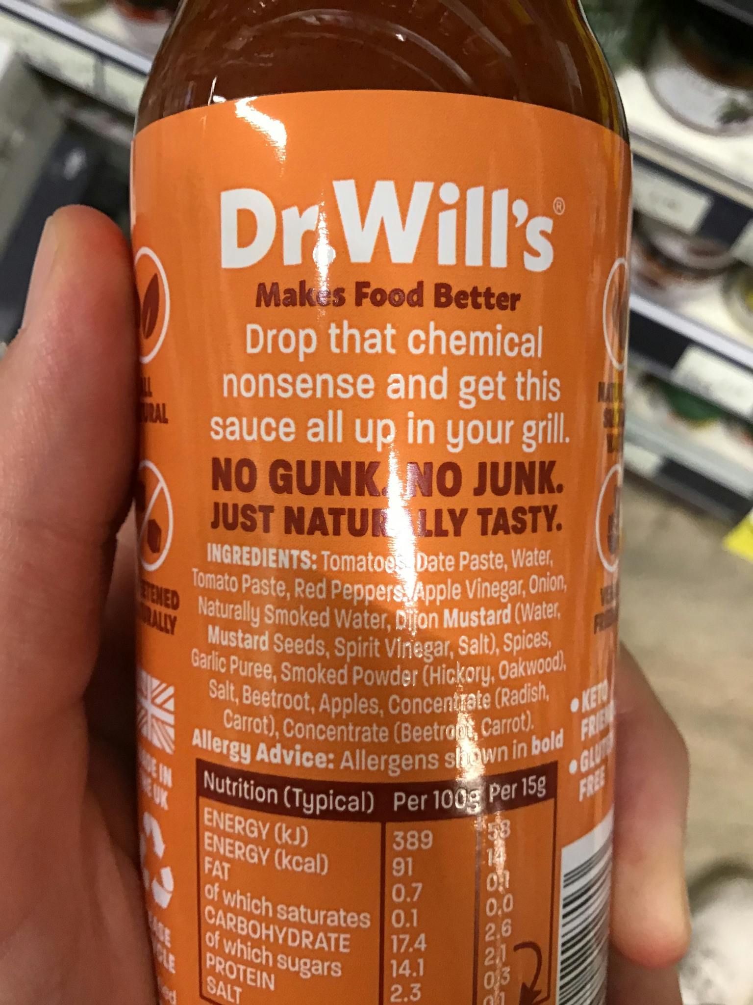
Dr Will's packaging
Puns, personality and product info packed into a 20-word morsel of copy. Delicious.
“We don’t play around with perfection. Our plump, organic cashews come already laden with natural flavor and sweetness. So we interfere as little as possible to keep their natural goodness intact.”
– Plenish, Cashew Milk
Proving that pack copy doesn’t have to tell jokes to be effective. Tasty descriptions and a clear point of view are plenty.
Adding value
These examples show there’s no single way to write BoP. But whatever your copy does, it should add value.
That value might come from a dumb joke that makes a shopper smile (the Innocent/Oatly tactic). Or flavor descriptions so sharp and evocative you can taste the product before you’ve tasted it.
It could bring you into the brand’s bigger mission, without preaching. Or it could be something as simple as ideas on how to use the product in interesting ways. It’s free bonus content. And that’s a lot harder to put down.
When BoP becomes FoP
Sometimes the words you’d normally expect to find on the back of the pack creep around into the light, appearing front and center as celebrated parts of the design. In the world of packaging copy, this is exciting stuff. With their impossible-to-miss ingredients lists, RX Bar is probably the most famous example of BoP becoming FoP.
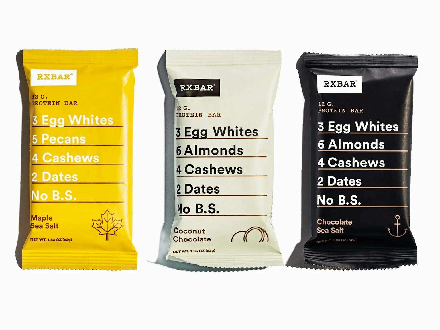
RX Bar's
But it wasn’t just the ingredients that made their way out front. A smart bit of copywriting joined them. The final “no B.S.” (bad stuff) is a touch that elevates each list into something more. Those four letters capture the whole idea of the packaging — showcasing the brand’s fluff-free voice and commitment to transparency.
Another example (and a bit of shameless self-promotion): British catalogue brand Argos used the power of prominent pack copy to elevate their value range.
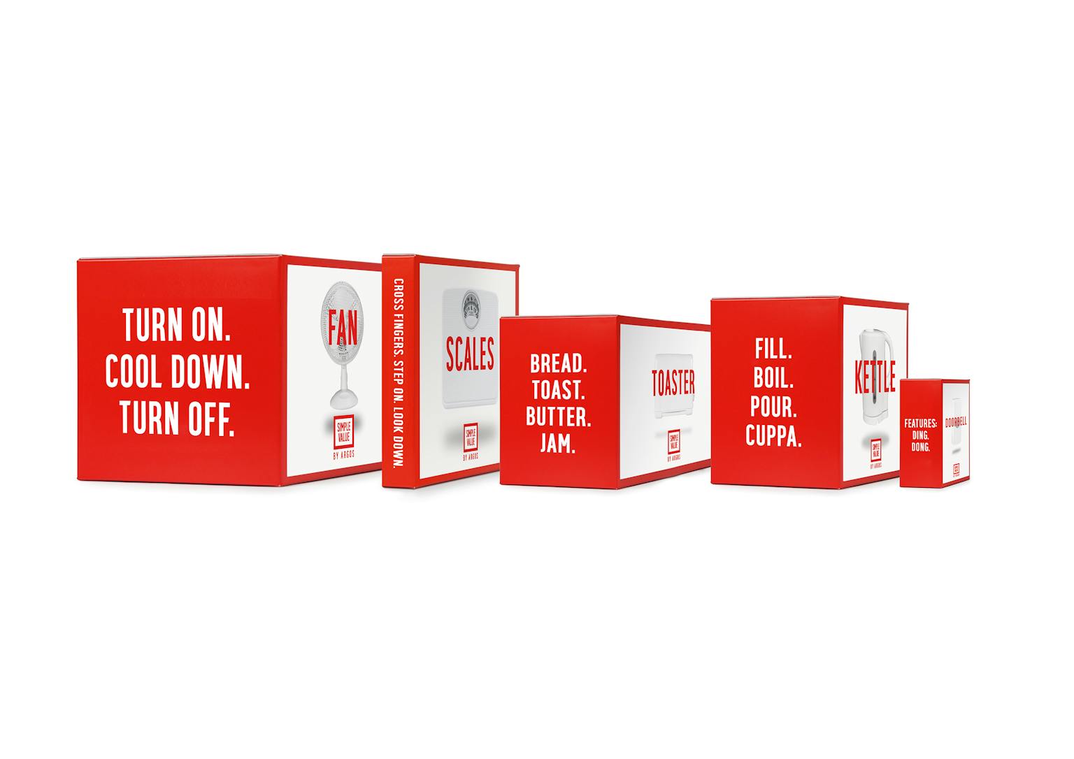
Argos' packaging
Each story is a few words max, but it brings you into the experience of using the product in a fun way. No shouty claims. No chatter. Just storytelling that helps a basics range feel a bit less basic.
“No one reads back of pack.”
This is something I’ve heard more than once working in design. BoP copy is usually low on the agenda, dashed out on the final fumes of the project budget. “It’s okay, no one reads it anyway.” Maybe. But my own experiences as a shopper tell me that’s not true. And if my own experience isn’t enough, ask Martin Lee, who applies the “effort equation” to cereal packaging in this article.
He points out that people do read pack copy, but only if they think it’s worth their time. If they see short, smartly laid-out writing, it tells them their attention will be rewarded. That’s how you get them to start reading. The rest comes down to the value of the words themselves. Sometimes those words are the clincher.
Without them, your brand’s not the full package.
This article was originally published in The Dieline.
Related articles.